top of page


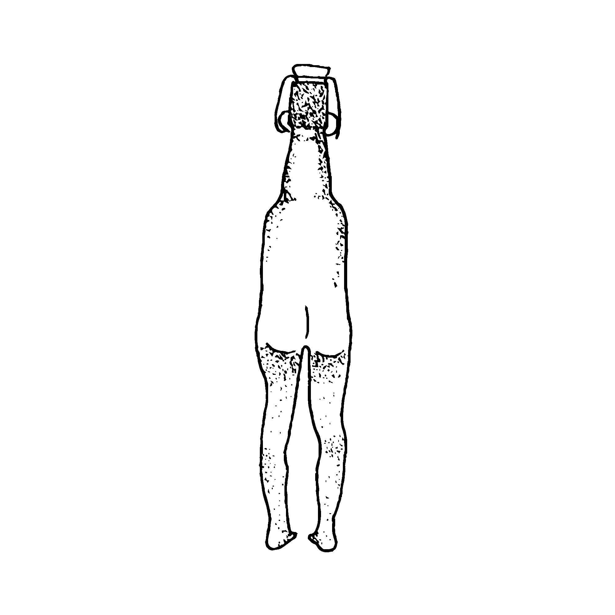
The colour yellow has naturally imposed itself on the identity of the brand, representing beer and the crackers. The halo, present in the logo, also insinuates barley grains. The visual identity is based on an imaginary world, like the Garden of Eden. The nude hybrid creatures made from beer bottles represent the subversiveness, cheekiness, and joy of the brand. The lush vegetation symbolises the diverse range of flavours Resurrection offers.
I created the logo using a linocut technique to express the authenticity of the brand. The imperfections and non-linear lines symbolise the uniqueness of each cracker. The halo illustrates the radiance and the dynamics of the brand. It can also, ironically, represents religious undertones. The perspective in the lettering conveys the idea of the circle of life.
RÉSURRECTION
Resurrection is a brand of crackers that rescues the nutritious grain created when soaking barley for beer production. It is during an internship in a Parisian micro-brewery that the brand's creators discovered the tragic end reserved for this grain after the brewing phase. They decided to save it from the trash and make it into tasty crackers to share.
- Building a strong fresh identity to represent their unique business on various mediums.
- Conveying authenticity and sustainability by telling the story of how Résurrection tackles food waste with innovative solutions through these delicious crackers.
- Having a fun, bold, unapologetic tone of voice to translate the joyfulness company's culture.
- Organic supermarkets, bars, and restaurants eager to provide new appetizers.
- Mainly suburban customers (25-40 y.o) aware of sustainability and curious to discover new taste, but also beer amateur.
Visual Identity
Illustration
Packaging


The packagings are sewn by hand using the sacks which previously carried the beer malt. From product to packaging, Resurrection uses only recycled products.


MISSION
CLIENT
TARGET AUDIENCE
SERVICES
bottom of page