top of page
FAÏZA
Faïza is a new French brand offering a range of different food products in collaboration with Carrefour. They mainly provide nuts, dried foods, canned vegetables, and halal food.
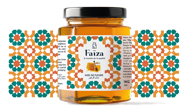
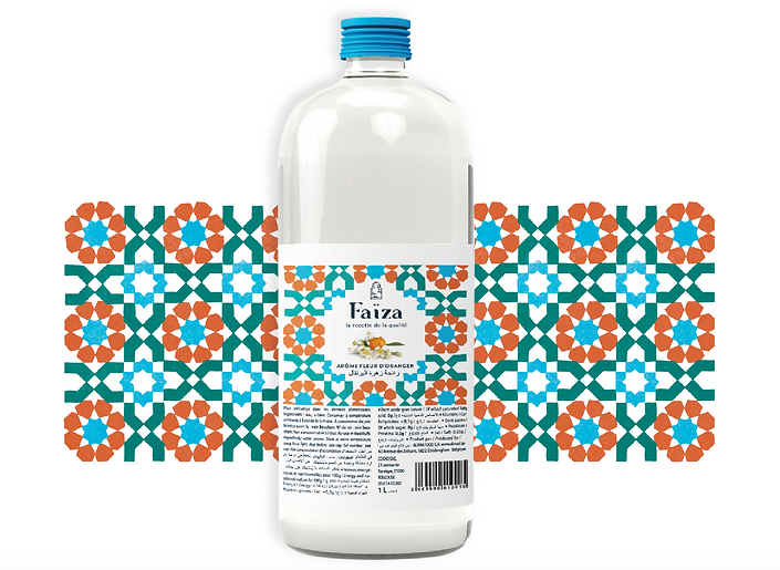
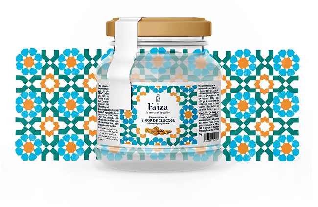
They reached out to me with the mission to create their brand identity. For their packaging design, I created playful and colorful illustrations based on the traditional Arabic tiles pattern.
Mainly an Arabic audience, eating halal.
Logo Design
Packaging Design


For their logo, I wanted the font to have similarities with the roundness of Arabic calligraphy.
The door is a reminder to all the beautiful doors that are part of the oriental scenery. It also provokes our curiosity and invites us to voyage, which is exactly the purpose of Faïza products. Its shape can remind the form of a keyhole, illustrating a cherished, almost secret traditional expertise.


SERVICES
TARGET AUDIENCE
MISSION
CLIENT
bottom of page
